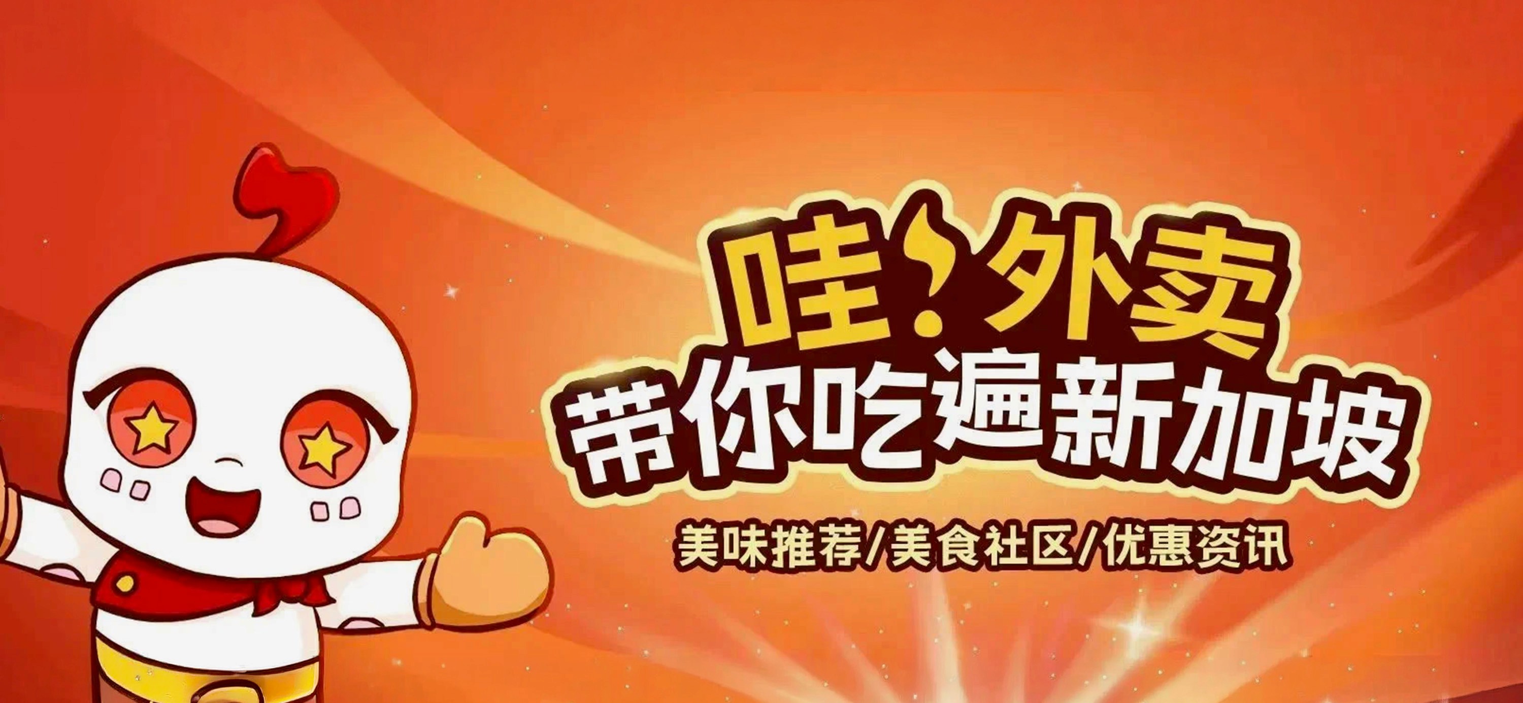
哇! 外卖 (WA! Food Delivery)
APP & Brand Design
Client
WA! SUPERAPP TECHNOLOGY
Year
2023
Category
UI/UX Design, Branding, Illustration, Animation
Team
Product Owner + 1 Lead Product Designer + 6 Developers + Me(Graphic Design, Animation, UI/UX Design)
哇!外卖(WA! Food Delivery) is a Chinese food delivery platform in Singapore that not only enables users to order from restaurants and also from home-based chefs. It has a social media feature called Food Hall, where everyone can effortlessly share and discover delicious food.
As the sole designer at this food delivery start-up, I expanded the existing mascot into a cohesive brand across all digital and communication touchpoints.

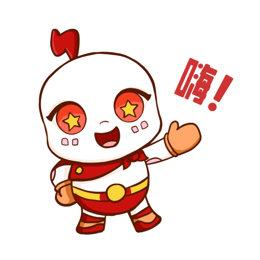
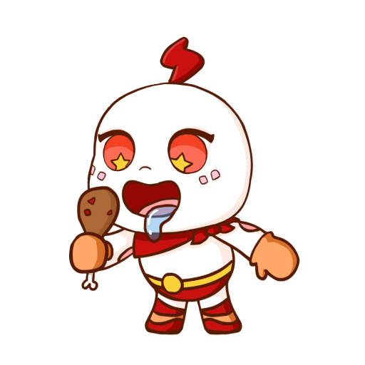
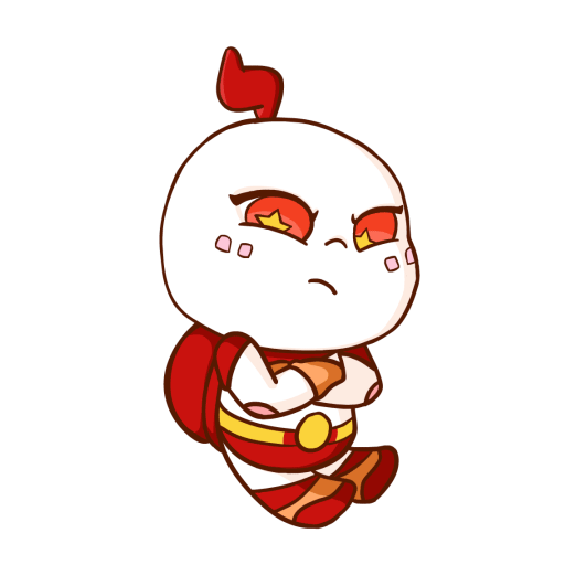
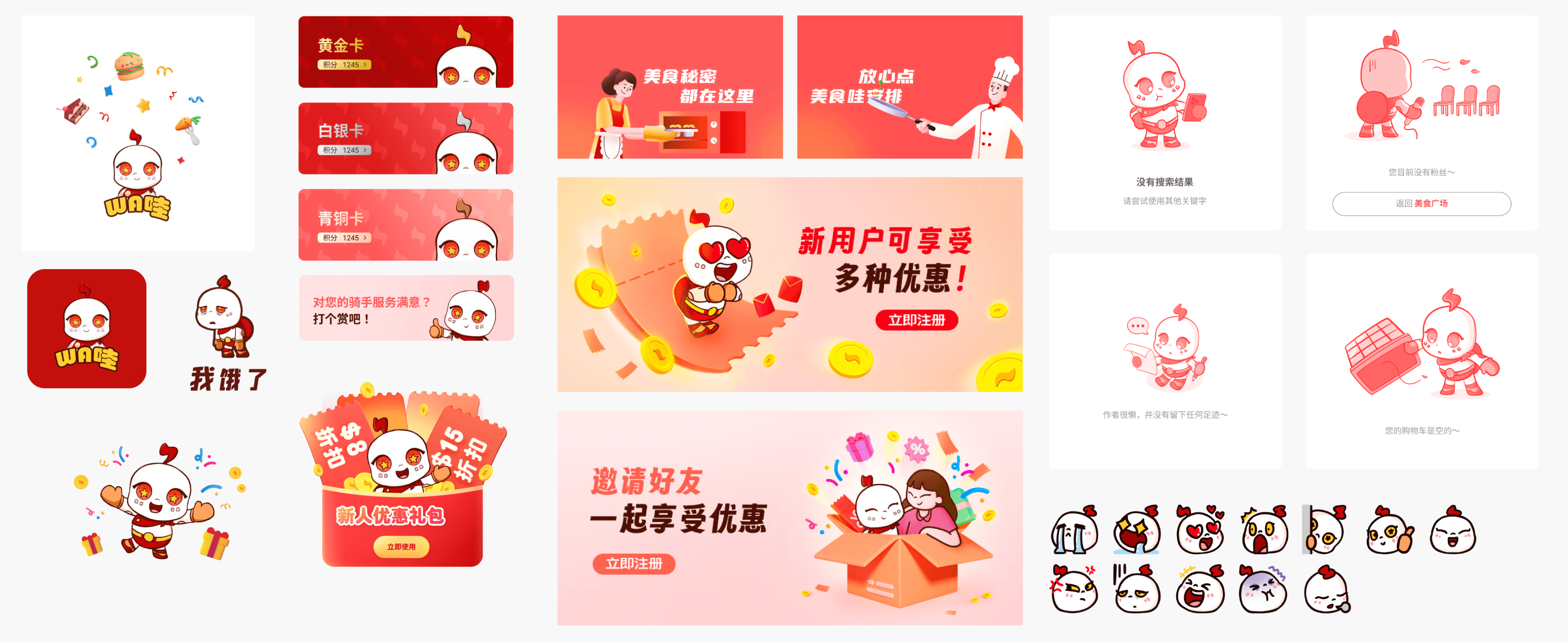
A superhero tortoise as a mascot
WA! Food Delivery’s mascot is a tortoise with a superhero cape, a playful juxtaposition of a slow animal promising fast delivery. The use of a mascot draws from the growing trend in China, where apps use characters to represent their brand and build recognition and affinity.


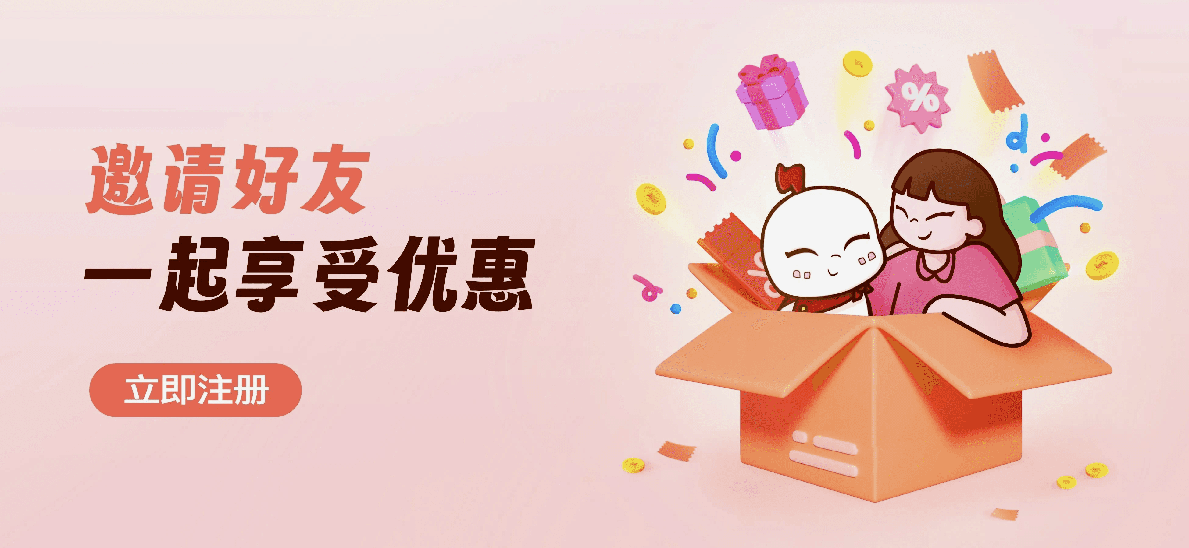
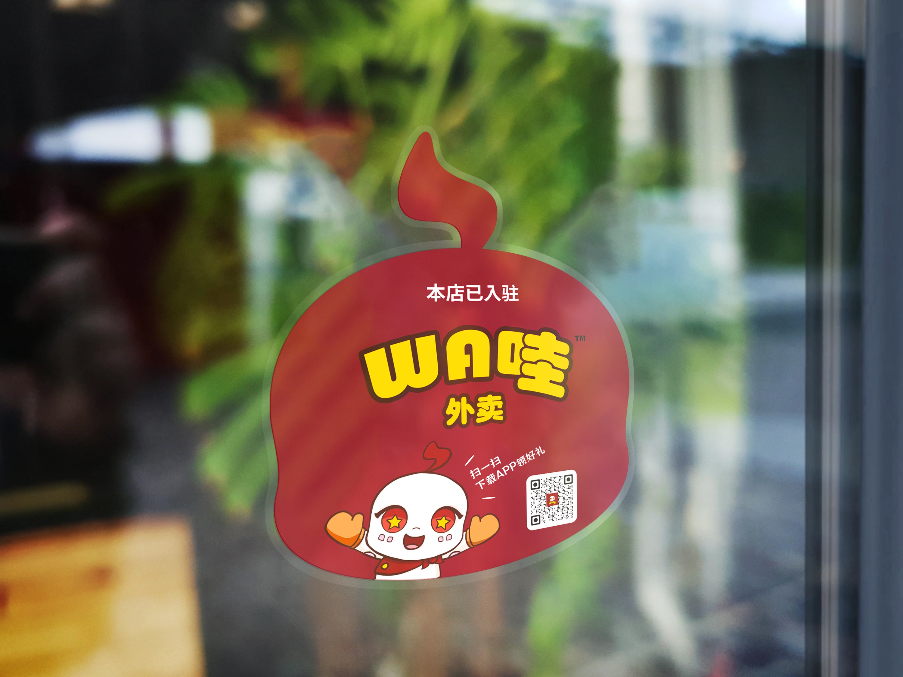
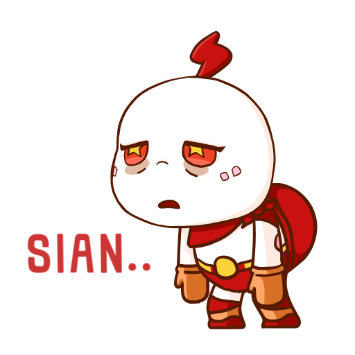
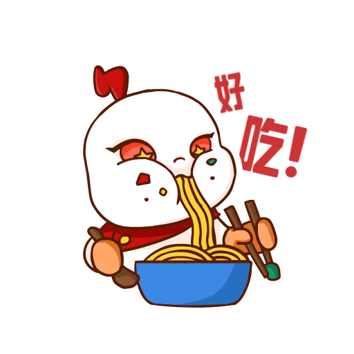
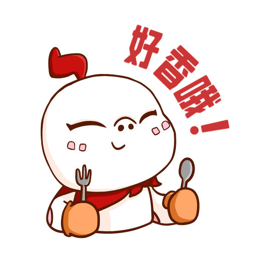
Assets were developed to increase brand recognition, including window and door decals for signed merchants, animated chat emojis, and promotional videos.

Animated chat emojis that are localised to the singaporean culture.


Animated illustrations
Created for use on the website and in job recruitment materials, adding a dynamic and engaging visual layer to support brand storytelling.


UI redesign case study for 哇! 外卖 (WA! Food Delivery)
As the UI/UX Designer, I focused on improving user experience while strengthening brand recognition within the app. This involved creating wireframes, visual mockups, and interface components that balanced usability with the brand’s playful personality.
This project was conducted in Mandarin; however, this case study is presented in English to ensure easier comprehension for a broader audience.
Problem discovery: The existing design felt outdated and did not appeal to the target users.
The UI design of our app is severely lacking as compared to the other food delivery apps. Someone once told us “No offence but your app design look like it was taken straight out of a template from Behance” and “The app looks outdated.”
The team then gathered to pin point on what was causing this problem. We then came to a conclusion that:

No appeal to target users
The app wasn't designed with the target audience in mind. It lacks design elements similar to those found in Chinese apps.

Poor design across screens
Obvious inconsistencies and poor visual hierarchy can be seen across all screens. Consequently, the overall design appears outdated.

No clear branding and strategy
The lack of personality resulted in a 'template' appearance. The only element incorporated from the brand is its colour.
User & Market research
One reason for the weak branding in the old design was the lack of understanding of our target user base. Our target users are set to be Chinese living in Singapore. Hence, in the redesign process, we considered what users are accustomed to in China.


Chinese vs Western App Design
One reason for the weak branding in the old design was the lack of understanding of our target user base. Our target users are set to be Chinese living in Singapore. Hence, in the redesign process, we considered what users are accustomed to in China.
As part of my research, I studied Chinese food delivery apps like 美团 and 饿了么, uncovering key differences from Western design. Chinese apps tend to favour a “more is more” approach, with dense layouts, vivid graphics, and multiple CTAs, creating a rich, engaging experience for users.

Solution: Finding a balance where the design will work.
As we plan to attract not only Chinese but also Singaporean Chinese to use our app, we can't just go with a purely Chinese design style. Instead, we need to strike a balance between Chinese and Western design principles. After discussing with the team, we have decided on the following points to work on:
Improve on the visual design to enhance usability.
Implement the new features and feedback that we've gathered from usability tests.
Set up a component library to ensure that designs are consistent across all screens.
Incorporate more of the brand and aesthetic elements of Chinese apps throughout the app.
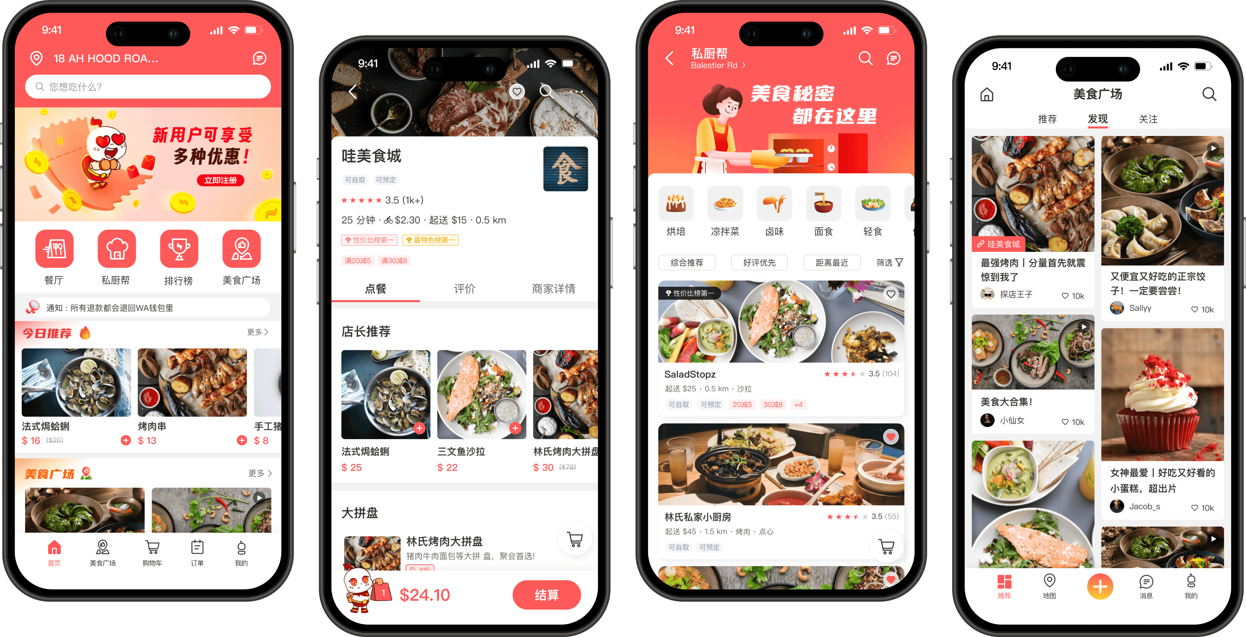
With branding incorporated, it brings personality to the app.
We incorporated the more of the mascot design into the app experience. I placed it in banners, promotional pop-ups, splash screens, empty states, loading animations, and many other spots. It's all about building that quick brand recognition and emotional bond with users. This help to boost brand engagement and builds brand equity.
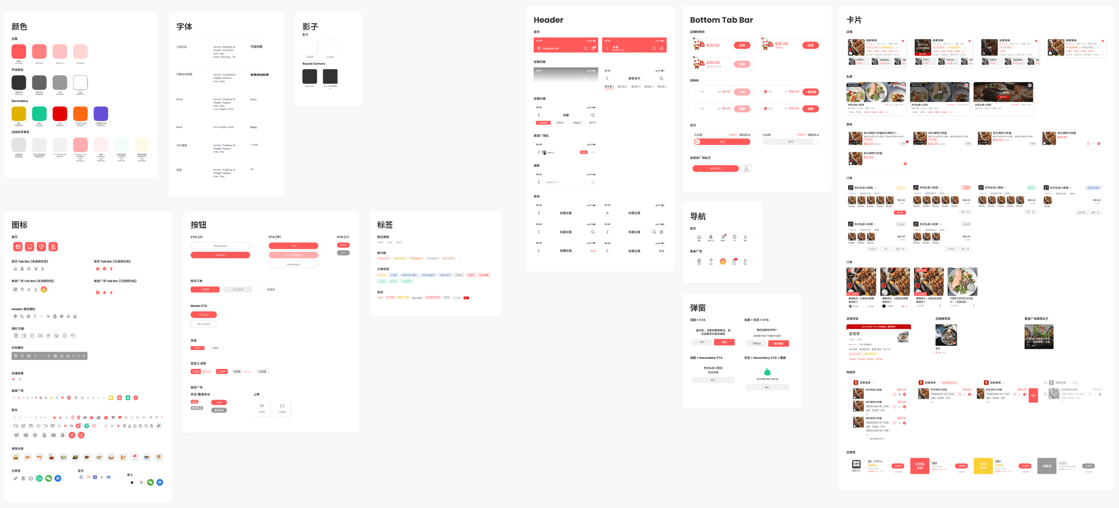
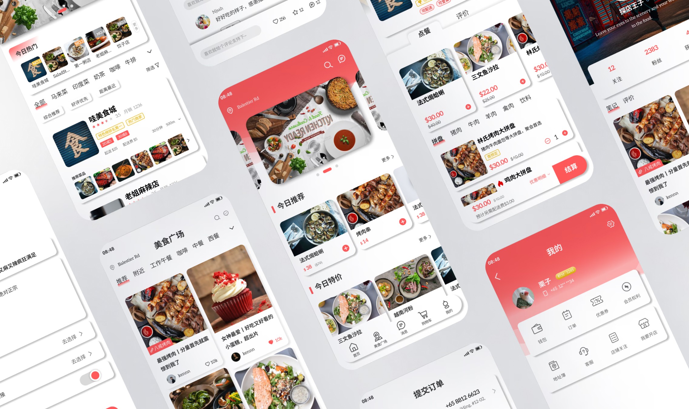
A component library is created to keep designs consistent.
To address the issue of inconsistent design in the existing design, I've set up a component library. This library comprises of components with clearly defined typography styles, icons, and illustrations. Its implementation ensures alignment among both new and existing team members.
Redesigns : Highlights
An estimate of 150 screens were redesigned. Almost all screens had to be redesigned due to their inconsistency with one another. Along the way, the team has also been enhancing various features based on user feedback gathered from usability testing.
'Aleo' was the font utilised in the old design. While it may appear suitable for Chinese characters, the English characters have a serif typeface that compromises text legibility.
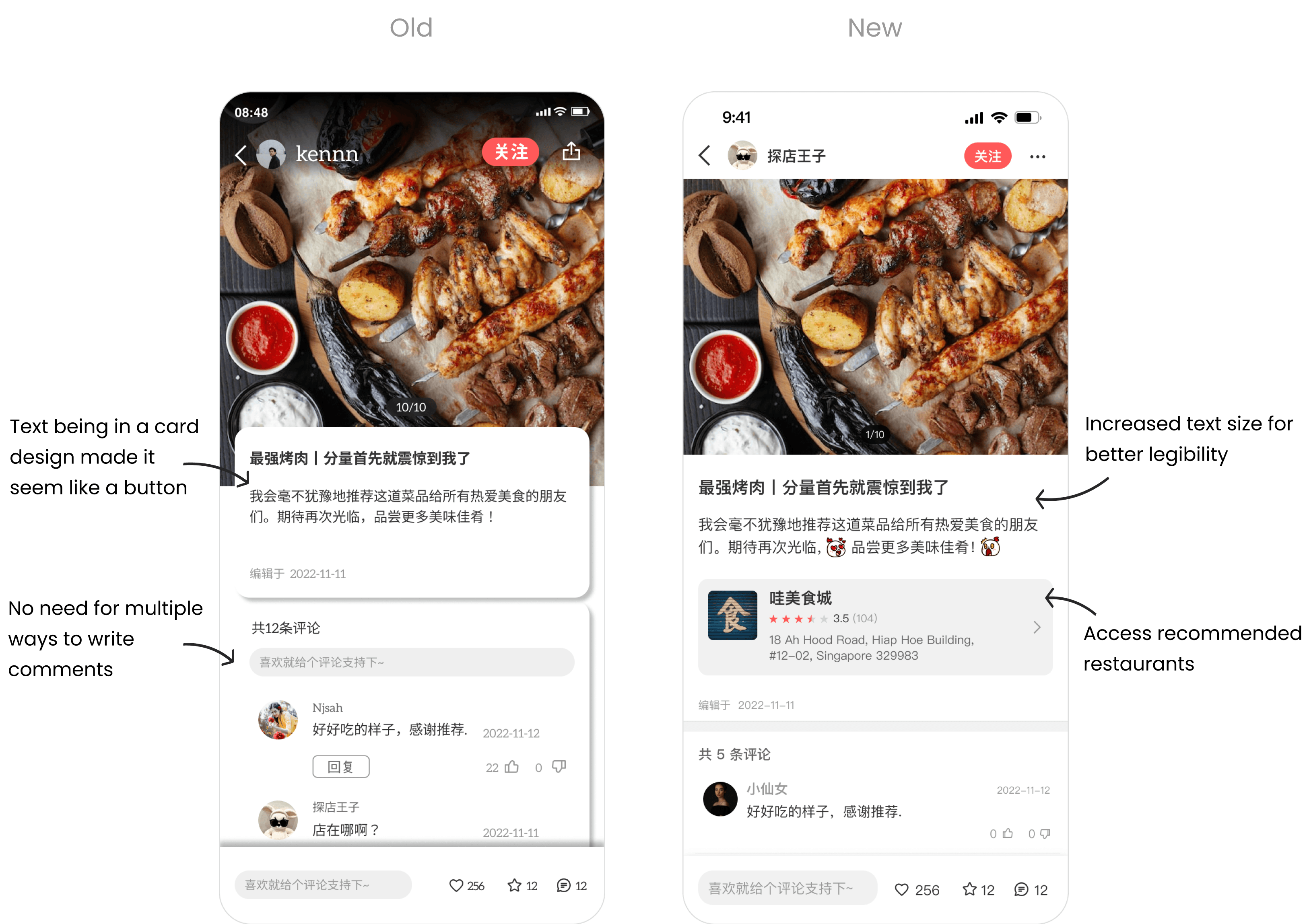
The shadows on the cards designs are also excessively prominent.
Old design
We've decided to opt for the ‘Pingfang 平方’ font for Chinese characters and the sans-serif font 'Roboto' for English characters in the new design.
Shadows were also reduced to be more natural looking.
New design
Revamped Homepage
The redesign of the homepage was pivotal in the overall redesign process, given its significance as the primary screen. I refined the layout of content, making it more compact while still ensuring ample white space.
Additionally, we introduced a quick access section for the main features of the app, including Restaurants, Home-based Chef, Ranking, and Food Hall, to enhance discoverability.
The navigation bar was also redesigned, prioritising functions that users use most frequently. Since there's already an entry point for notifications in the header, we replaced it with 'Orders,' a feature frequently accessed by users to check their order status.

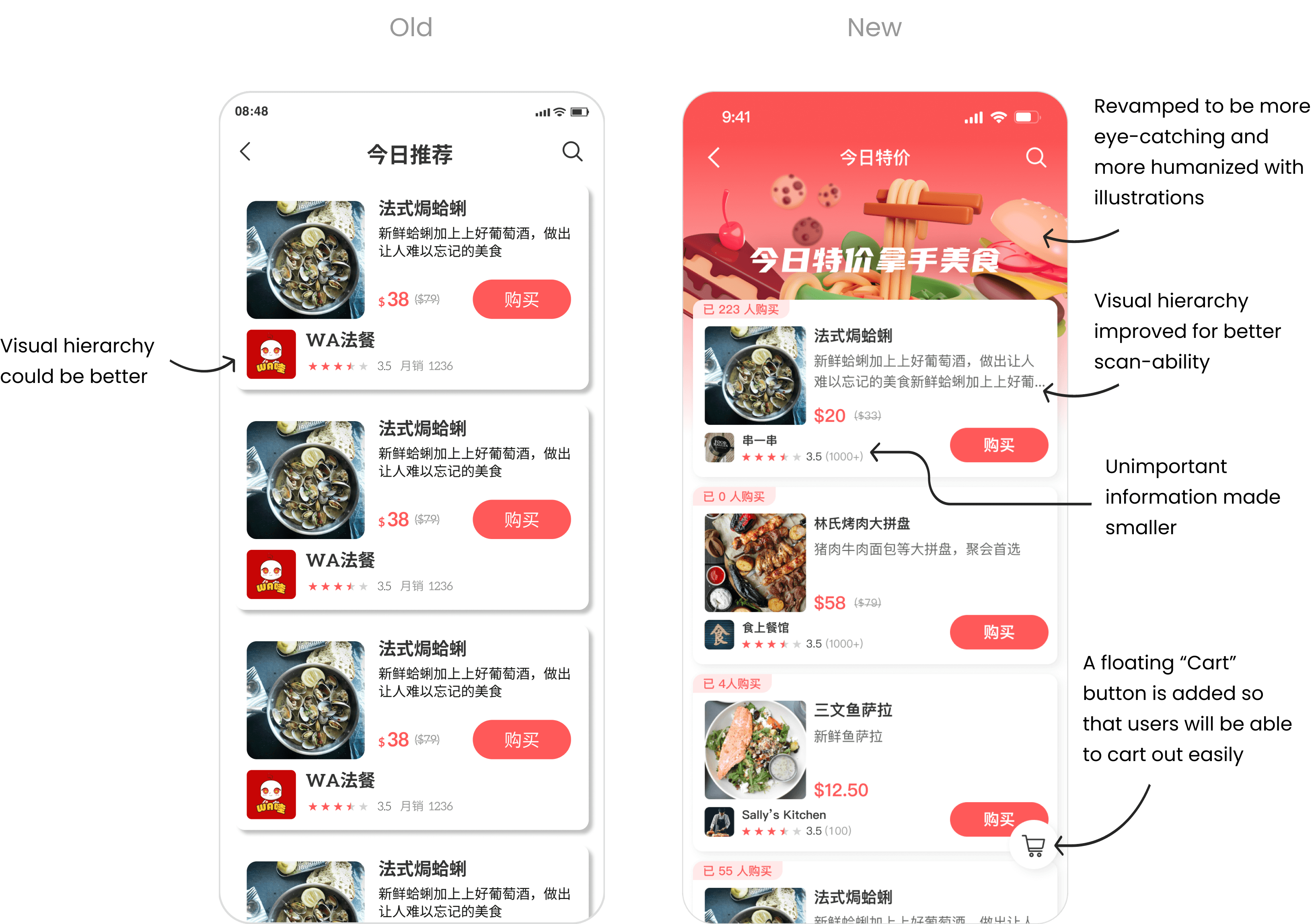
Redesigned special event page
I revamped the special event screens to make them more eye-catching with the inclusion of illustrations. Previously, the design made them appear like any other page, so I enhanced their visual appeal. Additionally, we decided to add a floating 'Cart' button for easy access, ensuring that users can quickly add items to their cart while browsing deals of the day.
Improved restaurant page
The old design is cluttered with information and has poor visual hierarchy. Key information like the delivery timing, delivery fees and minimum order fee are now displayed upfront. Whilst other unimportant information are moved to under ‘商家详情(Store’s detail)’ page.

In the previous design, the menu categories disappeared off-screen once users scrolled past them, making it inconvenient for users to access them again. To address this, we implemented a header bar that appears with the menu categories as users scroll down the menu, allowing for easy navigation through food categories without the need to scroll back.

Cart out multiple orders at once
Users can now cart out multiple orders from different restaurants all at once, and they can decide whether they want their orders delivered or if they prefer to pick them up themselves. Since these new features couldn't fit with the old design, I had to developed a new design to accommodate these new features.
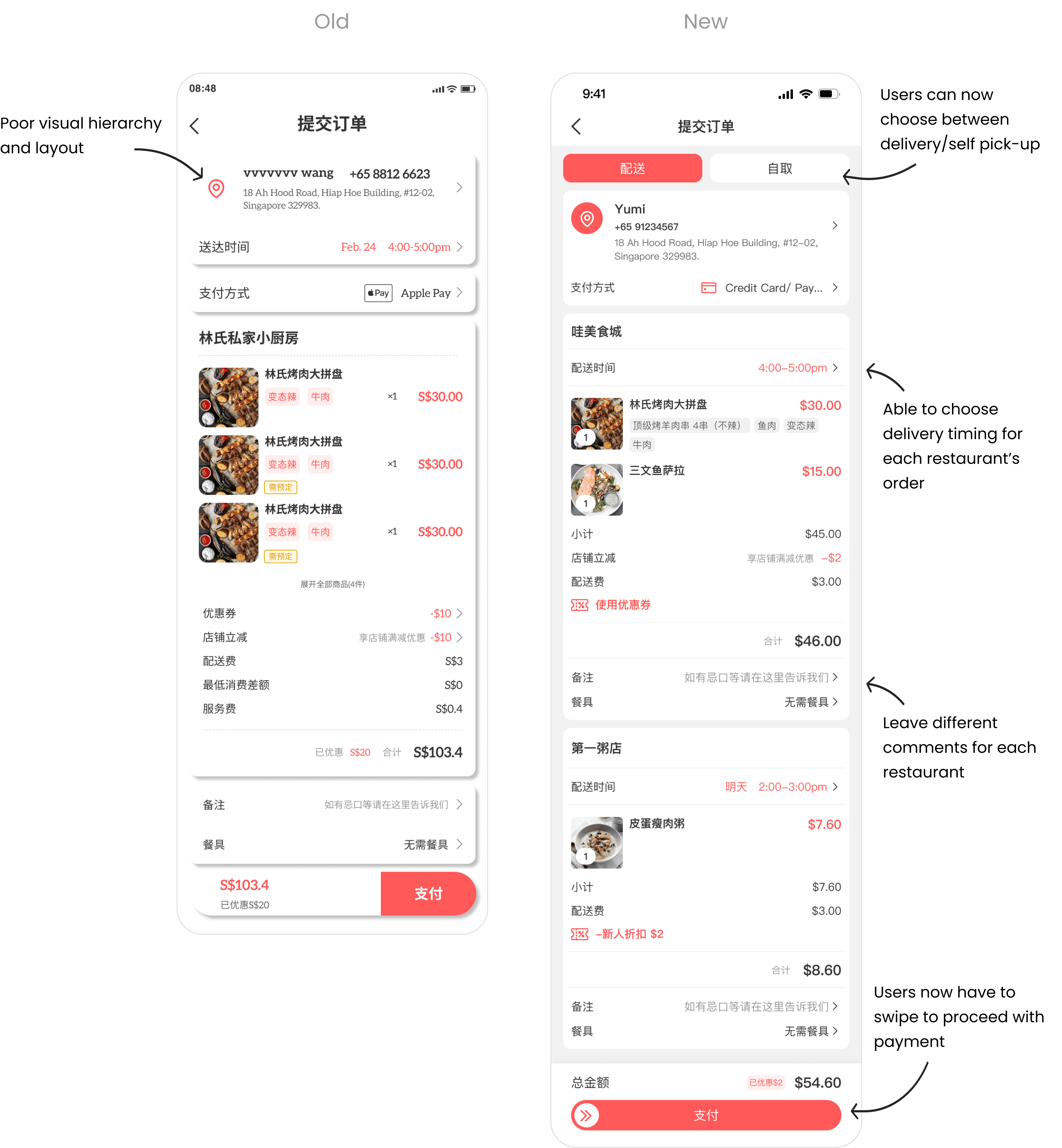
Revamped order details screen
I’ve rearranged the information on the order details page based on what the users would want to see based on the insights gathered from the usability test.